TBG Signature Guide

To users of the Truth Beauty and Goodness signature
This Signature Guide has been prepared for your benefit and contains guidelines and specifications for identifying the Truth Beauty and Goodness Commission, and for correctly using its name and signature (emblem).
The official name, as received in the Commission is: Truth Beauty and Goodness (using “&” is not permitted).
In form it is to be written exactly as shown above, by capitalizing the first letter of the first, second, and fourth words, and keeping the third word in lower case. Depending on the context, the word Commission with the first letter capitalized, may be added after the word Goodness. Appropriate punctuation can be used before and after the name, but the words that make up the name must never be divided by punctuation, dashes, slashes, uneven spacing or any other text treatment that will make it appear different from how it is displayed on the first line of this paragraph. This text only form of the name is to be used in copy text, and wherever a text only reference to the Commission is to be made. The typeface, font size, and appropriate styling shall be consistent with the intended use and the surrounding text. It should be written as normal text, and when necessary it can be italicized, or bolded, but never both in combination. Refer to the TBG Commission's official TBG Style Guide for additional guidance.
The signature is the official trademark and emblem of the Truth Beauty and Goodness Commission. Its specifications and usage rules are detailed in this booklet. It should be used in all cases where the Commission is to be identified symbolically by using a logo or emblem, whether publicly or privately. It should be treated with respect, and used with the intent of identifying the Commission and promoting and supporting the three values it represents: Eternal truth, universal beauty, and divine goodness.
Guidelines for using the signature
To preserve the integrity, strength and value of this signature (logotype and logo), you must use it correctly and consistently by following these guidelines.
DO's
- Use the primary signature whenever possible.
- Display the signature only in the forms specified by these guidelines.
- Keep the signature logotype and logo together. One exception is permissible, and that is for text only media.
Other exceptions are allowed only by permission.
DON'Ts
- Do not use the secondary signature unless the primary signature will not work in a specific situation.
- Do not alter the signature or any of its elements. Never use the logo (three circles) without the logotype.
- Do not combine the signature with any other element, logo, words, graphics, photos, slogans or symbols that might create a hybrid signature.
- Do not translate the signature's logotype into another language, or another character set such as Chinese, Russian or Arabic, without prior permission. Two permissible exceptions are Braille and sign language.
- Do not display the signature in a way that suggests another group or organization is part of the
Truth Beauty and Goodness Commission, or that it is part of something else.
Should such unions or partnerships occur, different signatures must be used to represent them.
Sample text treatments of the Commission's name for use in copy text
Normal text sample
The signature is the official trademark and emblem of the Truth Beauty and Goodness Commission. Its specifications and usage rules are detailed in this booklet. It should be used in all cases where the Commission is to be identified symbolically by using a logo or emblem, whether publicly or privately. It should be treated with respect, and used with the intent of identifying the Commission and promoting and supporting the three values it represents: Eternal truth, universal beauty, and divine goodness.
Italicized text sample (for emphasis)
The signature is the official trademark and emblem of the Truth Beauty and Goodness Commission. Its specifications and usage rules are detailed in this booklet. It should be used in all cases where the Commission is to be identified symbolically by using a logo or emblem, whether publicly or privately. It should be treated with respect, and used with the intent of identifying the Commission and promoting and supporting the three values it represents: Eternal truth, universal beauty, and divine goodness.
Bolded text sample (for strong emphasis)
The signature is the official trademark and emblem of the Truth Beauty and Goodness Commission. Its specifications and usage rules are detailed in this booklet. It should be used in all cases where the Commission is to be identified symbolically by using a logo or emblem, whether publicly or privately. It should be treated with respect, and used with the intent of identifying the Commission and promoting and supporting the three values it represents: Eternal truth, universal beauty, and divine goodness.
Never use italics and bold in combination: Truth Beauty and Goodness Commission <------- Not acceptable.
Underlined text
Should be avoided as a form of emphasis unless the situation expressly requires underlining. One such case is when using the Commission’s name as a hyperlink. Truth Beauty and Goodness
Shadowed text
Should not be used without prior permission.
Outlined text
Should not be used without prior permission.
Superscript and subscript
Should not be used without prior permission. It is hard to conceive of any situation where this would be required.
Line and page breaks
All reasonable effort should be made to avoid line breaks within the Commission's name when it is used in static documents (such as but not limited to print documents). When it cannot be avoided by using acceptable text and page treatments, then and only then is a line break permissible. Splitting the name of the Commission across two pages, or across two or more structural elements of a layout is not permitted under any circumstances. Adequate page and paragraph flow controls must be used to ensure the Commission’s name remains intact.
For obvious reasons this rule may be impracticable with dynamic and reflowable documents such as web pages and formats intended for small devices, and in such cases this rule may be overlooked.
Signature components
Primary signature. Preferred usage. Logotype on top, logo centered below.

Secondary signature. Use only when the primary signature is not workable.
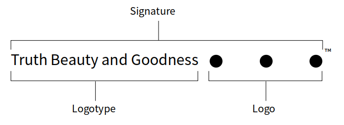
Signature typeface
The signature typeface (font) is Source Sans Pro. The font size will vary according to the use, but as a general rule for letter size documents, and as shown in the two examples above, Source Sans Pro 16 point is used.
Rotated signature
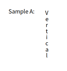
It is permissible to rotate the primary and secondary signatures 90 degrees clockwise, or 90 degrees counterclockwise for special use cases such as vertical banners and sidebars. The signature must never appear upside down. Never stack the logotype letters vertically, as shown in Sample A.
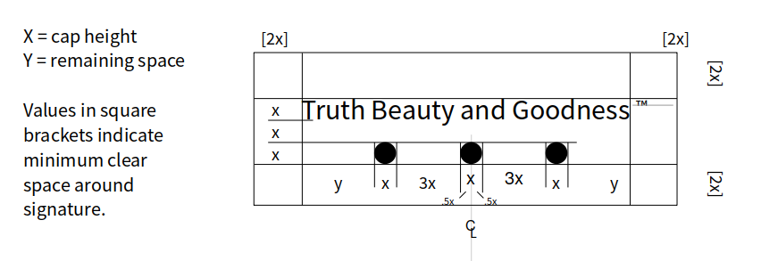
Spacing and proportions
Primary signature
Never use less than the minimum clear space, as shown. Never re-proportion the signature or any of its elements.
Trademark symbol
There are several ways of generating the ™ symbol and each way offers different spacing options. You should
attempt to align it to the baseline as shown, while maintaining an acceptable amount of horizontal spacing similar to the examples shown here. Keep it small, 10 point is used in this document.
Secondary signature
All proportions and spacing for the secondary signature are the same as the primary signature unless otherwise noted.
Logotype and logo must align on the same baseline as shown below.

Color usage
Any solid color is permissible, and applies to primary and secondary signatures.
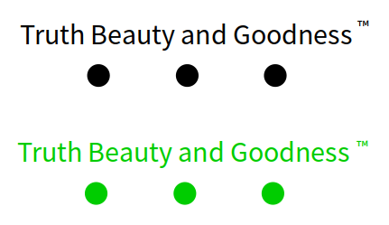
Single color version
A black and a green single color examples.
Two color version
Acceptable:
- Only solid colors.
- Logotype and logo may use different colors.
- All logotype words must be the same color.
- All logo circles (dots) must be the same color.
Two color examples.
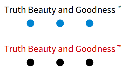
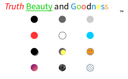
Unacceptable styling
Not acceptable: mixed colors and shades, shadows, hatches, images, graphics, symbols.
A few examples of unacceptable styling.
Signature backgrounds
Only single color backgrounds are permissible.
Black background: Logotype and logo colors may vary but should offer sufficient contrast against the background.
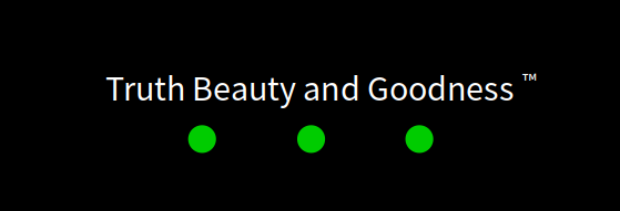
Colored background: Logotype and logo colors may vary but should offer sufficient contrast against the background and be color blind safe.

Colored background specifications are the same for the secondary signature.
Other backgrounds
Hatches, images, graphics, symbols, photos, drawings, gradients, and any background treatment other than solid colors are not permitted.
Size and scaling
Primary signature
Never use this signature smaller than 12 point font.
Secondary signature
Never use this signature smaller than 12 point font.
Additional considerations
3D signature
Never render the logotype (the text part of the signature) in 3D. The logo (three circles) may be rendered in 3D as three opaque spheres of solid color, all the same size, with the same lighting effect applied to each sphere.
Animated signature
Animating the signature is allowed only by permission.
Avatar and icon
A small rendition of the signature for online use as an avatar or icon is permitted. The logotype may be reduced to the three upper case bolded letters T B G with two spaces in between each letter and the three dots directly below.
The previously stated rules for coloring, background, scaling etc shall apply.
Icon examples.
![]()
Note: an all white (with transparent background) version of this icon is used as the logo in the top left hand corner of tbgcommission.org

No Comments